Before I animate anything, I try the interaction with no motion at all.
If nothing becomes harder to understand, the animation was never doing real work. That test has saved me from more decorative transitions than any motion guideline ever has.
Useful motion has a job: it gives context, confirms an action, clarifies a state change, or shows where something came from. If it only looks polished, cut it.
Motion that explains a layout change
Accordions make the point quickly. Without animation, content appears and the page jumps. With a short expand, the section you clicked becomes the origin of the change, and the rest of the layout follows.
Both versions are usable. The animated one is easier to follow because it explains the transition instead of forcing you to re-parse the new layout instantly.
That is the bar I use for layout motion: does it reduce surprise, or does it just delay the inevitable?
Feedback should be felt, not watched
Buttons are different. You already know what a click does. What you want is confirmation that the interface registered it, especially when the real result takes a moment.


A slight press is enough. If the motion is more noticeable than the action, it is competing with the task.
Good micro-interactions disappear into the feel of the product. If someone compliments the animation, I usually made it too loud.
State changes need continuity, not ceremony
A switch is an explicit state change. Instant jumps work, but a short travel between positions makes the before and after feel connected.


I would rather ship a slightly dull switch than one that turns every toggle into a ceremony. Continuity helps; performance theater does not.
The same idea applies to tabs, checkboxes, selected rows, and filters: animate the relationship between states when that relationship matters. Skip everything else.
Show where something came from
Tooltips are easy to over-design and easy to under-connect. An instant tooltip is readable, but a quick fade with a slight move from the trigger makes the source feel obvious.


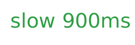
The slow version usually fails the moment you use it twice. The animation did not become clearer. It became something you wait for.
Duration is the most common failure mode, but not the only one. Motion also fails when it fights the layout (content shifts while you try to click), when every element eases in like a hero moment, or when reduced-motion preferences are ignored and the interface keeps bouncing anyway.
A few craft defaults I trust
These match the with-motion examples above. They are starting points, not laws. Feedback and snappy controls (button presses, quick menus) usually sit around 120-200ms. Local state and origin cues, like switch travel or a tooltip entering, feel right closer to 180-280ms.
Layout explanation can run longer when the job is reducing surprise; accordion height often needs about a quarter to a third of a second of visible travel.
If the motion makes you wait, like a ~900ms menu open, it needs a clear explanatory job, or it is too slow.
Ease out for things arriving, ease in for things leaving. Springs fit physical controls; linear easing almost never does for UI. And respect prefers-reduced-motion: prefer instant state changes, and keep only the color, opacity, or position updates that still carry meaning without the flourish.
When in doubt, shorten first. Most “premium” motion I regret shipping was just long.
A simple rule for deciding whether to animate
Try the interaction without motion.
Then ask what the user loses.
If they lose context, feedback, a clear state change, or a sense of origin, add motion.
If nothing becomes harder to understand, leave it alone.
The best approach is usually to add the smallest amount of motion that solves the problem.
Not the most impressive animation.
Not the most complicated one.
Just enough to make the change easier to follow.
Motion should have a job
A good micro-interaction does not ask anyone to stop and watch. It quietly confirms an action, explains a change, or keeps context intact while the interface moves.
When motion does that work, it stops being decoration and becomes part of the interface.
The goal isn't to make an interface move. The goal is to make a change easier to understand.