Every frontend developer reaches this point sooner or later.
You start with a simple app. You build a few buttons, a couple of forms, maybe a modal. Everything feels clean. Then the thought arrives:
“We should make this reusable.”
That’s usually where things begin to go sideways.
Reusable components are supposed to reduce duplication, speed up development, and bring consistency. But if you’re not careful, they do the opposite. You end up with components that are hard to understand, harder to change, and somehow never quite fit the use case you actually have.
I’ve learned this the hard way. More than once.
This post is about designing reusable components that stay helpful—without turning into a design system that everyone quietly avoids.
The First Trap: Reuse Too Early
Most component nightmares start with good intentions.
You see two similar buttons. You abstract them. Then a third button appears—slightly different. You add a prop. Then another difference. Another prop. Soon your button looks like this:
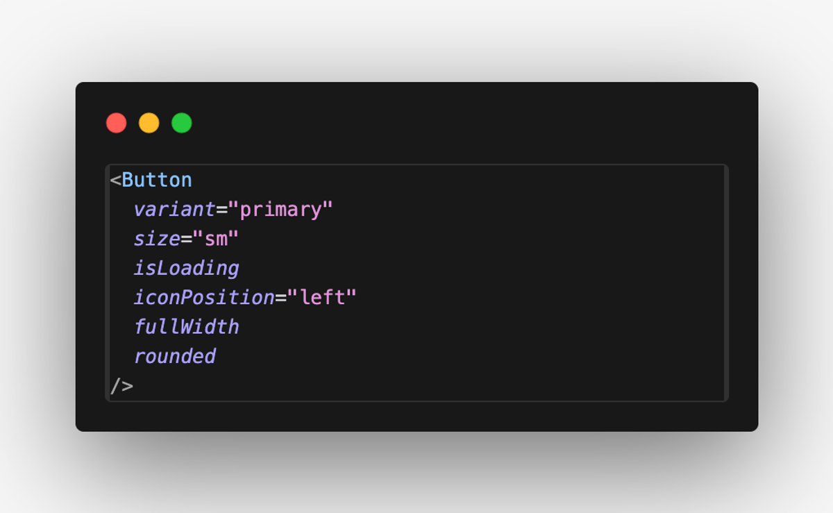
At this point, the component technically supports everything—but no one remembers what it’s actually meant for.
The mistake here isn’t abstraction. It’s premature abstraction.
Before making something reusable, I now ask myself a simple question:
“Do I understand the variation well enough to freeze an API?”
If the answer is no, duplication is often the cheaper and safer choice.
Reusability Is About Constraints, Not Flexibility
A common misconception is that reusable components should be flexible.
In reality, the best reusable components are opinionated.
They solve a specific problem really well. They don’t try to cover every future scenario. When a component is designed to do everything, it becomes impossible to reason about—and even harder to change.
A good reusable component usually has:
- A clear responsibility
- A small, intentional API
- Obvious usage patterns
If someone needs to fight the component to use it, that’s a smell. Reusability should reduce thinking, not increase it.
Composition Beats Configuration
One of the biggest shifts in my thinking was moving away from configuration-heavy components.
Instead of adding more props, I now lean on composition.
Compare these two approaches:
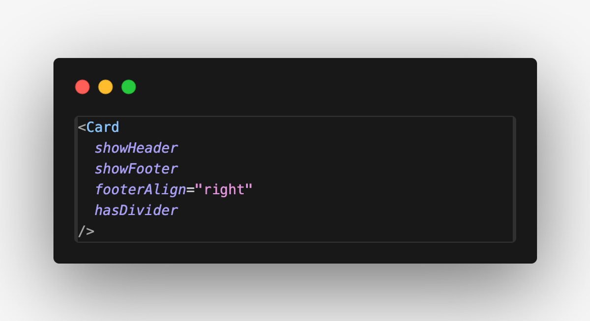
Configuration-heavy
Composable
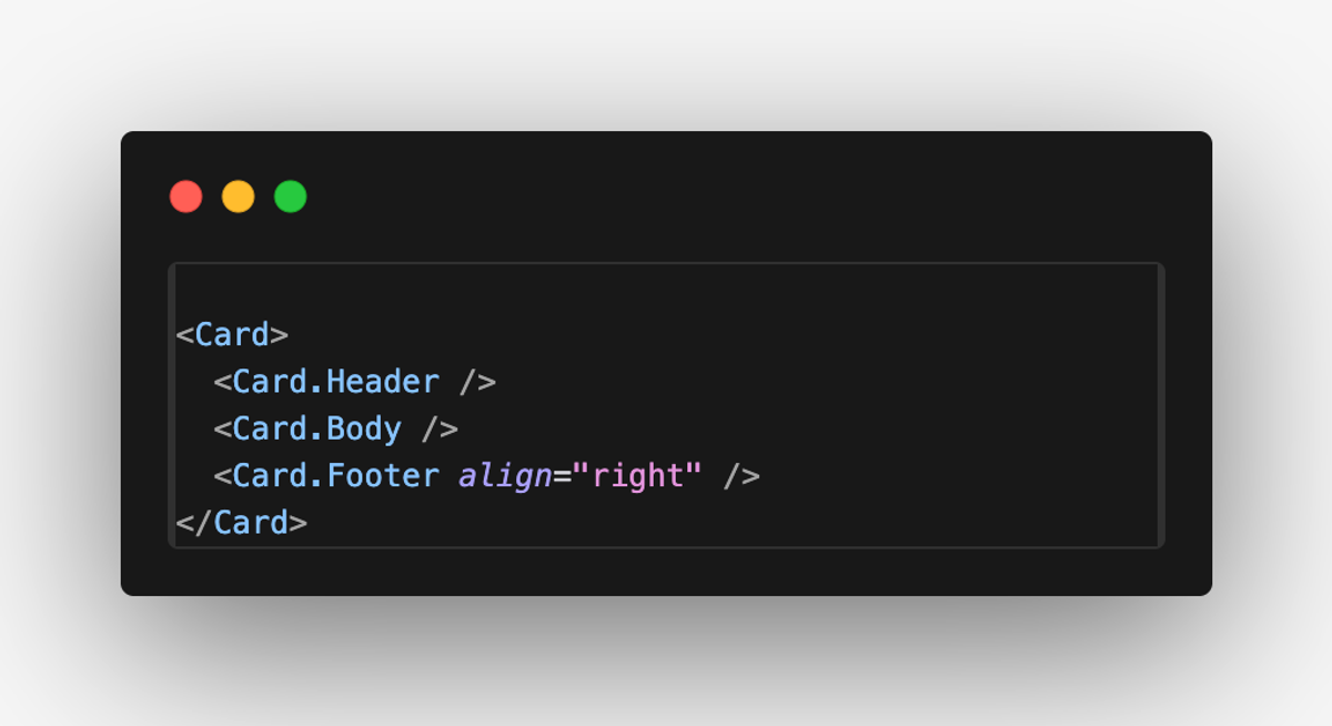
The second version is:
- Easier to read
- Easier to extend
- Harder to misuse
Composition keeps components small and predictable. It also makes future changes less scary, because you’re not breaking a giant prop-driven API.
Don’t Build a Design System—Earn One
Many teams accidentally build a design system by just… adding components to a folder called components/ui.
A real design system isn’t a folder. It’s an agreement.
It’s an understanding of:
- What problems we solve the same way
- What variations are allowed
- What should not be customized
Until those patterns naturally emerge, forcing a design system usually creates friction. Developers either:
- Bypass it
- Fork components
- Or add hacks that slowly rot the codebase
I’ve found it healthier to let a system emerge from real usage. Once patterns repeat and stabilize, then it’s worth formalizing them.
Reusable Doesn’t Mean Global
Another mistake is assuming reusable components must be shared across the entire app.
Sometimes the best place for a reusable component is close to the feature that uses it.
Feature-scoped components:
- Are easier to evolve
- Carry more context
- Avoid accidental coupling
If a component truly belongs everywhere, it will naturally migrate upward. Forcing it into a global shared layer too early usually makes it less usable, not more.
A Simple Rule I Now Follow
Whenever I design a reusable component, I ask:
- What problem does this solve?
- Who is this component for?
- What should this component not allow?
If I can’t answer those clearly, the component isn’t ready to be reused yet.
And that’s okay.
Final Thought
Reusable components are not about saving lines of code. They’re about saving mental energy.
The goal isn’t to create a perfect design system. It’s to build components that feel boring, predictable, and easy to live with six months later.
If your components make the next change easier instead of harder, you’re doing it right.
Everything else is just noise.